Teammates:
Helen Li
Sarah LaDuron
Jacob Beck
Maxton McGuire
Project:
SculptShare was a concept for an app that allowed users to create 3D sculptures out of basic shapes in Augmented Reality. These sculptures would be viewable using AR in the real-world location they were built in. We prototyped the building portion of the app and conceptualized the social aspect.
Duty:
– User Interface Design
A mock-up animation of the app made by Sarah LaDuron.
When designing the UI for this app, I had three main goals: make the UI easy to pick up and use, create a fun and engaging atmosphere, and keep the UI from distracting the user from the 3D sculptures they were creating and viewing.
To make it easy to pick up and use, I took steps to try to make the button layout easy to memorize. I spaced them out across the screen to help the user develop muscle memory, and gave most buttons an icon rather than a label in order to make them visually distinct and intuitive.
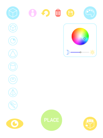
A mock-up of the UI. All assets are final except the color selector and slider.
To create a fun and engaging atmosphere, I gave the UI a bright, varied color palette. I thought the variety of colors made the UI feel playful, which was how I felt whenever I tried out a new iteration of the prototype. I wanted the app to feel like a playground rather than a stuffy environment, as I usually feel more creative when I’m in a playful mood.
To keep the UI from distracting the user, I made the colors slightly faded and the button icons fairly minimalistic. We all wanted the focus to be on the artwork, and I felt this type of design would make the buttons easy to see, but not intrusive. The drop-down menus allowed the UI to provide these options while taking up less screen space so the sculptures could take up more. The eye-shaped button also lets the user manually hide the rest of the UI when they want to observe their sculptures without interacting with them.


I think with more time, I’d re-work a couple of the buttons. The Place button doesn’t really fit with the rest of the icons and the Profile and Grab buttons are a little unclear. I would also probably try making the buttons semi-transparent, as it would make the UI even less intrusive. However, I think I managed to give the UI the playful atmosphere I was going for while still making it look professional. This is my most recent UI project, and I’m excited to take the lessons I learned about clarity and non-intrusiveness forward into future projects.
